

25.08.2026

We’re continuing our look at the “Deadly Dozen” data science mistakes – the costly errors that can derail otherwise promising analytics projects. Last time, we explored why relying on a single modeling technique can limit what you learn from the data. But even the best combination of models won’t help if they’re aimed at the wrong target. That brings us to Mistake 4: Aim at the Wrong Target.
I hear that U.S. Army units never see themselves as surrounded, but instead as being in a “target-rich environment”. Data scientists have this same confidence and dilemma when bringing advanced analytics to a new client; a vast array of potential projects vie for attention. Where to begin? If you start with a project that is either too challenging or not meaningful, there may never be a second project. Start instead with one that works in the lab, is trusted to implement, and has great returns. Then, your team will be called on for interesting work and new advances for years.
This blog reveals how to choose the right target at three levels: business, project, and model. In other words, how to choose: a promising project, a worthy goal for that project, and a criterion of merit guiding the model to care about what you care about.
Before deciding which analytics or AI project to pursue, it helps to understand whether the organization is equipped to make it successful. We often assess readiness across five areas[1] – analytics, culture, process, people, and infrastructure – to identify barriers and opportunities. After the assessment we create an actionable roadmap for success.
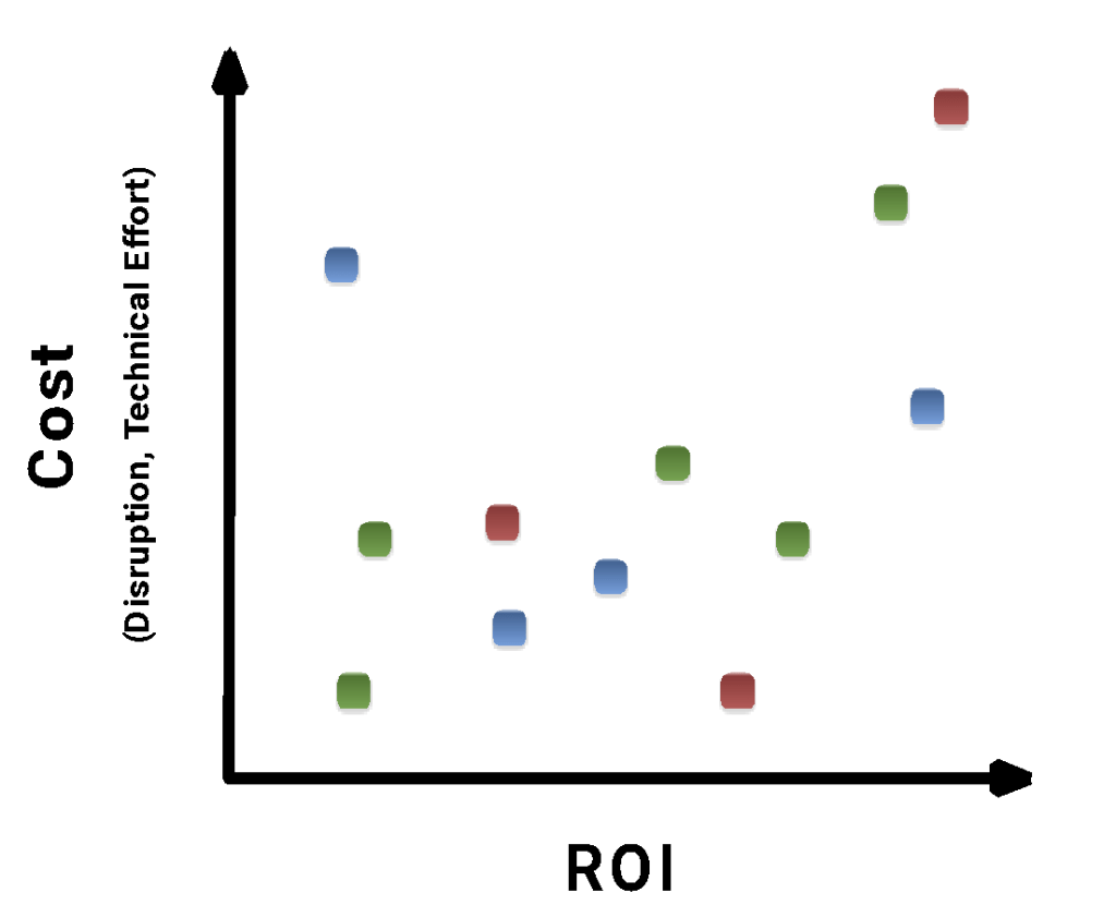
That assessment also surfaces potential project ideas. Start with a project promising high potential return on investment (ROI) and relatively low cost and risk – get on base before swinging for the fences.
Potential ROI must be adjusted by the probability the project will be implemented. Cost includes factors such as time required, complexity, data quality (thoroughness, readiness, accessibility), technical debt, and the disruption to normal operations the project will likely cause. Below, we show a set of projects on a scatterplot of total estimated cost vs. expected ROI, where their color corresponds to the division of the business. Start with the project – for each division – furthest in the lower-right quadrant.
Once you’ve chosen the right project, the next challenge is making sure you’re asking the right question of the data. Even a well-executed project can miss the mark if it is solving the wrong problem.
This was exemplified by a project at Shannon Labs (part of the legendary Bell Labs), led by Daryl Pregibon[2], to detect fraud in international calls. The conventional approach would have been to build a huge model to distinguish the rare, expensive cases of fraud from vast examples of non-fraud. Instead, the researchers formulated the problem in a different way; they characterized normal calling patterns for each account (phone number) separately, and looked out for outliers within that account. When a call departed from what was the normal pattern for that account, an extra level of security was initiated, such as an operator becoming involved. For instance, if one account typically called France and Germany each week, briefly, during weekdays, a call to Ecuador on the weekend would require scrutiny. Efficiently reducing historical billing information to its key features, creating a mechanism to adapt at the right speed, and implementing millions of small models in real time for vast streams of data, provided interesting research challenges. Still, the key to success was asking the right question of the data. The ongoing “account signature” research won technical awards (at KDD[3], for example). More importantly, four researchers working part time for a year were able to save Bell Labs enough money to pay the costs of 400 people for the next year[4] – an impressive 200:1 example of data science ROI.
Even with the right project goal, it is essential to also have an appropriate model goal. You want the computer to “feel” about the problem like you do – to optimize for what really matters. That is, the model’s metric for evaluation should penalize what the business wants to avoid and reward what it wants more of. But analysts and tool vendors almost always use squared error as the criterion because it is fast and easy to apply, though it is not tailored to the problem.
For example, imagine that you’re trying to decide whether to invest in a company’s stock, and build a model using squared error. Say it forecasts that the price will rise from $10 to $11 in the next quarter, and it goes on to instead rise to $14. We’ve enjoyed a positive surprise; we expected a 10% gain, but got 40%.[5] But, when entering in that data for the next go-round, the computer has a different response; it sees an error of $3 between the truth and the estimate, and squares that to a penalty of 9. It would have more than twice “preferred” it if the price had fallen -$1 to $9; then, its squared error would only have been 4. A criterion which instead punishes losses much more than unexpected gains (or missed opportunities) would better reflect our preferences. In this example, you don’t really need to forecast the price or return but instead should focus on getting the direction right.
Though conventional squared error can often put a model into a serviceable region of performance, the function being optimized has a significant effect on the suitability of the final model. “Inspect what you expect” is seasoned advice about managing projects. As a teaching analogy, you won’t produce the best-spelling students if your grading has focused on penmanship. When performance is critical, have the computer do not what’s easiest for it or us, but what’s most useful for the project.
To best handle custom metrics, analysts need to have handy a good multi-dimensional multi-model optimization algorithm. I focused my PhD dissertation on developing a strong global search algorithm and it was vital to some of our earliest breakthroughs.[6] Still, use of even simple random search with a custom score function is often better than not customizing.
Squared error is built into almost all modeling algorithms. It makes sense for regression because the optimal coefficients can be calculated instantly when coefficients linearly affect the estimate and squared error is the metric. But it makes no sense for decision trees, where there is no speed advantage as each possible split for a node must be exhaustively evaluated. There, it would be better to have least absolute error (LAE) as the default metric, as it is more robust to outliers and usually closer to one’s intent. But a custom metric can improve even on LAE and is relatively easy to add to a tree algorithm.[7]
The default metrics in classification are also suspect. Percent correct is used in most classification studies. But that implies all errors are equal in impact. Are they ever? If we endure a false alarm for a fire, it’s a nuisance. But the false dismissal of a real fire could be catastrophic. Of course, the cutoff still needs to be calibrated carefully: too many false alarms will lead people to ignore all alerts.
A lift chart, as shown below, plots the tradeoffs in accuracy for a model’s alarm threshold – here, for mortgage fraud. The x-axis is the proportion of cases examined, and the y-axis is the cumulative proportion of fraud cases identified. A model ranks the cases for fraud, so the most suspect ones are at the far left on the x-axis and least interesting at the far right. The solid line is the model’s performance tradeoff: as one moves from left to right more cases are called “bad” (equivalent to lowering the threshold). The dotted line is what randomness is expected to do, and the dashed line is the limit of the best possible model.
As you move left to right, more cases of fraud are caught, but also more false alarms occur. The best tradeoff, and thus threshold to use, depends on the relative cost of those two types of errors. For example, in credit scoring, it takes roughly seven good clients to pay for one bad client that defaults. That equilibrium corresponds to a particular spot on the curve. What you look for is the spot on the curve that maximizes expected return. That is the best metric to use.
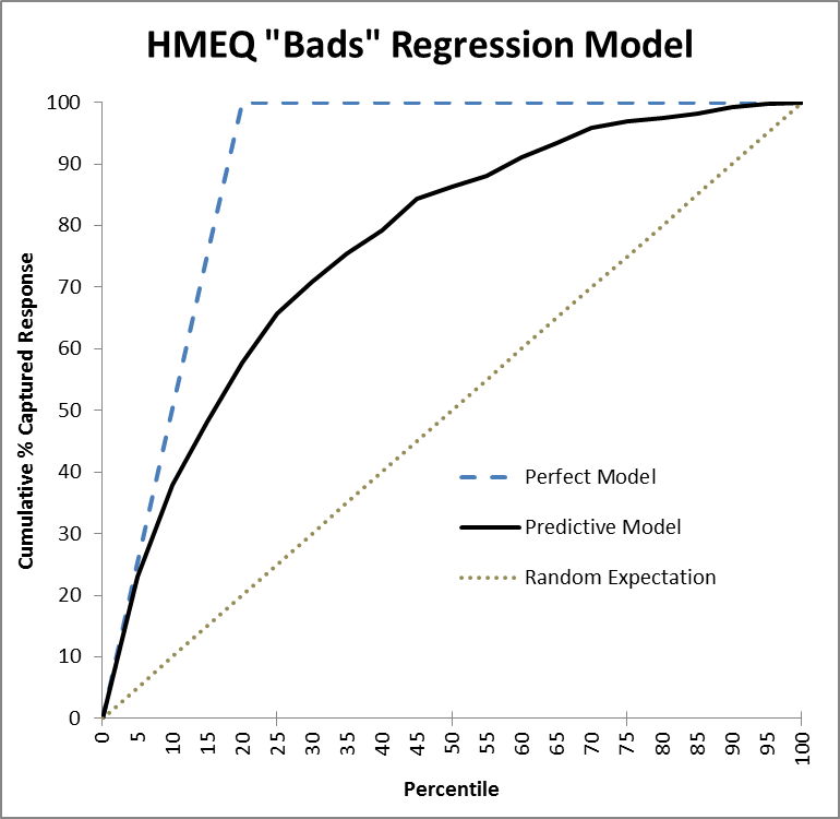
However, the default model metric used with lift charts is Area Under the Curve (AUC). It scores a model by the area between the solid line and the x-axis. This is correlated with, but much less useful than, expected return. AUC is a mathematically incoherent metric, as I explain in that earlier blog, and it ignores the business costs that should be the focus!
Astonishingly, almost every published work on lift charts emphasizes AUC. Similarly, the vast majority of estimation models employ squared error. And most classification work seems to still use percent correct. But these default metrics are almost never the best ones to use, and it is a mistake to not try a better metric. Though fitting models using custom metrics is not easy, it has been a key reason why we’ve achieved breakthroughs on some very challenging projects.
Aiming at the right target matters at every level. Start with a project that has meaningful value and a realistic path to implementation, make sure you’re asking the right question of the data, and then optimize the model for the outcome you care about. Great data science aimed at the wrong target is still a miss.
[1] Each with four or five components.
[2] I had the great fortune to collaborate with Daryl Pregibon on an influential chapter for arguably the first book on data science (before it got that name). (The chapter is “A Statistical Perspective on Knowledge Discovery in Databases,” in Advances in Knowledge Discovery and Data Mining, U. Fayyad, G. Piatetsky-Shapiro, P. Smyth, R. Uthurusamy, eds., MIT Press, 1996, pp. 83-116.) Daryl is a great writer and was head of Statistics at Bell Labs. He was unusual, for a statistician, in being a snappy dresser and in having great respect for the potential of AI. He departed his lofty perch to join a risky new company called Google.
[3] The annual Knowledge Discovery and Data Mining conference.
[4] They were rewarded, as we techno-nerds like, with bigger toys. The group got a “Data Wall” – a 10’x20′ computer screen, complete with couch, with which to visualize data. As it was often commandeered by management for demonstrations, the research group was eventually provided a second Data Wall to actually use.
[5] Of course, our joy is short-lived, as we kick ourselves for not mortgaging the house and betting even more! Fear and greed are always at war within markets.
[6] In 1993, I created a global search algorithm for multi-modal surfaces which refines a smooth model of the score surface as information is gathered. It is very efficient, in terms of function evaluations, but requires a lot of overhead, which restricts it to a few dozen dimensions (simultaneous factors) in practice. There is still a need for efficient high-capacity global search methods.
[7] For instance, when ordering a meal for a group gathering, which is worse: too much food or too little? Too much is a bit wasteful (though in my experience teams are happy to feast for days), but too small an order could lead to a social disaster. Here, I’d recommend using a small linear slope as the penalty for over-ordering and a steeper slope for under-ordering.