

30.09.2026

We’re continuing our look at the “Deadly Dozen” data science mistakes – the costly errors that can undermine otherwise promising analytics projects. In Mistake 4, we looked at what happens when teams aim at the wrong target. But even when you’re asking the right question, the data itself can lead you astray if you treat it as the whole story. That brings us to Mistake 5: Listen Only to the Data.
Inducing models from data has the great virtue of looking at the data afresh unconstrained by old ideas. But, while you “let the data speak,” don’t ignore existing wisdom about the problem domain. Almost always, a good solution comes from close teaming between domain experts and analytics experts.
Often, nothing inside the data can protect us from making seemingly significant, but wrong, conclusions. We must look outside of the data and especially ask ourselves how the data that came to us might differ from the full picture.
Let’s look at a real example in detail. The table below contains two variables about US high schools, by state: average cost and the rank of average SAT score. Let’s say our task is to model their relationship to advise a state of the costs of improving their educational standing, especially relative to nearby states. Figure 1 illustrates the relationship between the two variables and includes a linear regression line. The positive correlation is very significant statistically.[1] Astonishingly though, the relationship is the opposite of what is expected! That is, to improve our standing (lower our SAT ranking), the graph suggests we need to reduce school funding.
Spending and Rank of Average SAT Score by State in 1994
| USA State | SAT Rank | $ Spent |
|---|---|---|
| AK | 31 | 7877 |
| AL | 14 | 3648 |
| AR | 17 | 3334 |
| AZ | 25 | 4231 |
| CA | 34 | 4826 |
| CO | 23 | 4809 |
| CT | 35 | 7914 |
| DC | 49 | 8210 |
| DE | 37 | 6016 |
| FL | 40 | 5154 |
| GA | 50 | 4860 |
| HI | 44 | 5008 |
| IA | 1 | 4839 |
| ID | 22 | 3200 |
| IL | 10 | 5062 |
| IN | 47 | 5051 |
| KS | 6 | 5009 |
| KY | 18 | 4390 |
| LA | 16 | 4012 |
| MA | 33 | 6351 |
| MD | 32 | 6184 |
| ME | 41 | 5894 |
| MI | 20 | 5257 |
| MN | 3 | 5260 |
| MO | 13 | 4415 |
| MS | 12 | 3322 |
| MT | 19 | 5184 |
| NB | 8 | 4381 |
| NC | 48 | 4802 |
| ND | 2 | 3685 |
| NH | 28 | 5504 |
| NJ | 39 | 9159 |
| NM | 15 | 4446 |
| NV | 29 | 4564 |
| NY | 42 | 8500 |
| OH | 24 | 5639 |
| OK | 11 | 3742 |
| OR | 26 | 5291 |
| PA | 45 | 6534 |
| RI | 43 | 6989 |
| SC | 51 | 4327 |
| SD | 5 | 3730 |
| TN | 9 | 3707 |
| TX | 46 | 4238 |
| UT | 4 | 2993 |
| VA | 38 | 5360 |
| VT | 36 | 5740 |
| WA | 30 | 5045 |
| WI | 7 | 5946 |
| WV | 27 | 5046 |
| WY | 21 | 5255 |
Figure 1: Rank of a State (in average SAT score) vs. its spending per student (circa 1994) + the least-squares regression estimate line
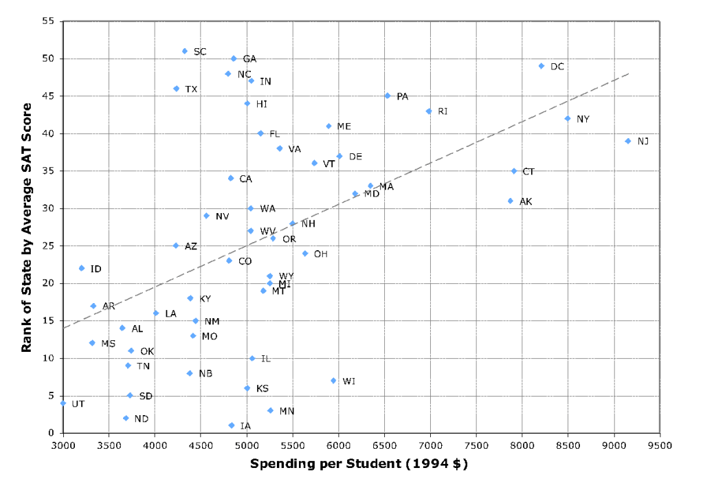
When I show groups this problem participants will often suggest gathering further state data – for example, living costs or percent rural or urban population – to potentially help explain what is happening. But additional demographic variables, even if they have some small effect, miss the real problem. The breakthrough came for me by focusing on the best-ranked states, which all had something (outside the data) in common: their state universities (which are much more affordable than private ones) all require the competing ACT test. Students from ACT states who also take the SAT test are largely aiming at more prestigious institutions. Those samples are self-selected, causing their scores to be higher.
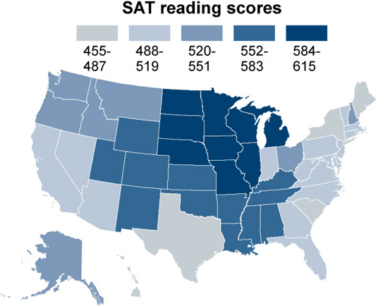
A state’s average SAT score (or the rank thereof) is not a good proxy for educational quality because the proportion of students taking the SAT varies widely by state. The states with a high proportion of students taking the SAT are highlighted in Figure 2, and their distribution is almost a perfect inverse of the states with high SAT reading scores, shown in Figure 3.[2] On reflection, this inverse relationship is obvious, and it reveals that the average SAT metric is useless. This further means that the strong negative correlation between spending and SAT scores is completely spurious. Remember, nothing in the original data could reveal this.[3]
Figure 2: Proportion of eligible students taking the SAT test by state
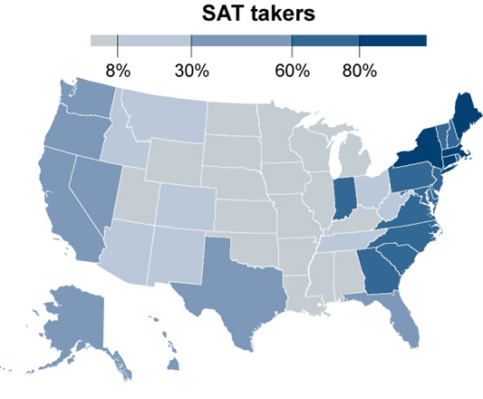
Figure 3: Average SAT reading scores by state
The above example analysis application employed “opportunistic”, or found, data. Most data science problems rely on such data and there is always a risk that such data are in some way missing key examples (censored), self-selected, biased, or distributed differently from the problem’s true underlying data. But even data generated by a designed experiment needs external information. For example, a national defense project from the early days of Neural Networks attempted to distinguish aerial images of forests with and without tanks in them. Perfect performance was achieved on the training set, and then also on an out-of-sample set of data that had been gathered at the same time but not used for training. This was celebrated at first but, wisely, an additional confirming study was performed. New images were collected and the model performed very poorly on them. This drove investigation into the features driving the models and revealed them to be magnitude readings from specific locations of the images; i.e., background pixels. It turns out that the day the tanks had been photographed was sunny, and the day non-tank images were collected was cloudy![4] Even resampling the original data wouldn’t have protected against this error, as the flaw in the data was inherent in the generating experiment.
Another tank example from Dean Abbott[5] illustrates the same danger even more vividly. Dean had worked at a San Diego defense contractor, where they sought to use radar to distinguish tanks vs. trucks at different angles. Because radars and mechanized vehicles are bulky and expensive to move around, they fixed the radar installation and rotated a tank or a truck on separate large, rectangular platforms. Signals were beamed at different angles, and the returns were extensively processed – using polynomial network models of subsets of principal components of Fourier transforms of the signals – and great accuracy in classification was achieved.
However, in seeking greater transparency, Dean discovered, much to his chagrin, that the source of the key distinguishing features determining vehicle type turned out to be the bushes beside one platform![6] Further, it is suspected that the angle estimation accuracy came from the signal reflecting from the platform corners – not a feature one will encounter in the field. Again, no modeling technology alone could overcome flaws in the data; it took careful study of how the model worked to discover its weakness.
The lesson is not to distrust the data, but to recognize what the data cannot tell you on its own. Whether you’re working with found data or a carefully designed experiment, ask how the data was generated, what might be missing or biased, and whether the patterns your model finds make sense in the real world. The strongest solutions come from combining what the data reveals with what domain experts know about the problem – and making sure the model is learning what you think it is.
[1] The t-statistic is over 4, suggesting that such a strong relationship occurs randomly only 1/10,000 times. This theoretical result is confirmed by Target Shuffling; it takes about 104 randomized trials (shuffle the rankings and re-fit) before a correlation this strong is measured. Target Shuffling is the advanced resampling technique, to be detailed in the 13th blog in this series, that can protect analysts from spurious correlations due to multiple comparisons. But even it does not solve the problem here.
[2] Figures 2 and 3 are from [economix.blogs.nytimes.com](http://economix.blogs.nytimes.com/)
[3] The remaining mystery is why ACT states spend so much less per student than SAT states. Meanwhile, if one instead employs NAEP (National Assessment of Educational Progress) scores — an educational metric with near-universal test participation — one finds no relationship between spending and outcome.
[4] PBS featured this project in a 1991 documentary series “The Machine that Changed the World”: Episode IV, “The Thinking Machine”.
[5] A close friend and former colleague who wrote a very useful book on data science.
[6] This excellent practice of trying to break one’s own work, is so hard to do even if one is convinced of its need, that managers should pit teams with opposite reward metrics against one another to proof-test solutions.